Introduction to Matplotlib - A Beginner’s Guide to Effective Plotting
What is matplotlib? And why?
What is matplotlib? And why?
Well, it is a library that is built using Python to create static, animated, and interactive visualizations. Matplotlib is a widely-used library in various roles across different fields that require data visualization. Here are some career roles where Matplotlib is commonly used.
Ex:- Data Scientist, Data Analyst, Machine Learning Engineer, Business Analyst, Statistician and many more.
This is often used in feature engineering in machine learning. Here are some common ways it is utilized.
- Visualizing Data Distributions - Matplotlib can create histograms, box plots, and density plots to understand the distribution of features, identify outliers, and decide if any transformation is needed.
- Exploring Relationships Between Variables — Scatter plots, pair plots, and heatmaps can reveal correlations and interactions between features.
- Evaluating Feature Importances: Bar plots can be used to visualize feature importance scores, which can help in feature selection.
Let’s understand some basics of Matplotlib.
Figure
In Matplotlib, a Figure is the container for all plot elements. It contains one or more Axes (the plots or subplots) and other special elements like titles, legends, and colorbars.
1. Creating an Empty Figure
import matplotlib.pyplot as plt

fig = plt.figure()  # an empty figure with no Axes

plt.show()
Run this code using python file_name.py And you will see this output
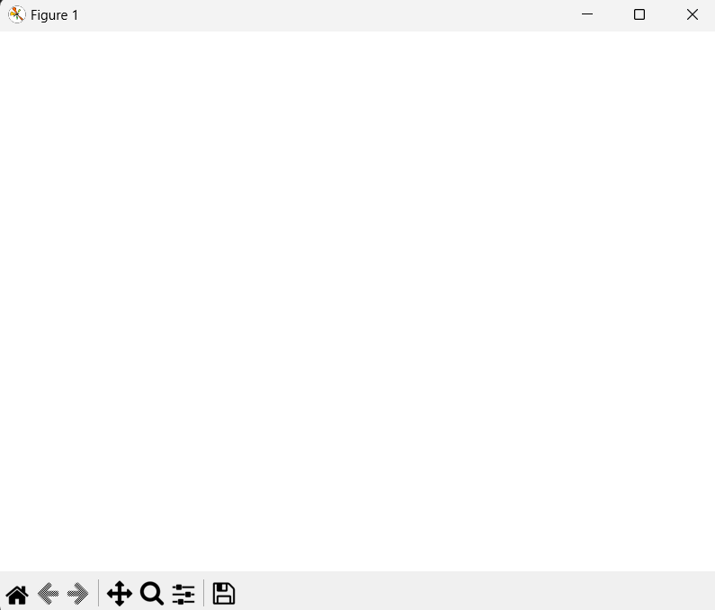
- This code creates an empty figure. A figure is essentially the canvas or the space in which you’ll draw your plots. However, this figure has no Axes (plots) initially.
2. Creating a Figure with a Single Axes
import matplotlib.pyplot as plt

fig, ax = plt.subplots()  # a figure with a single Axes

plt.show()
Run the code and you will see this.
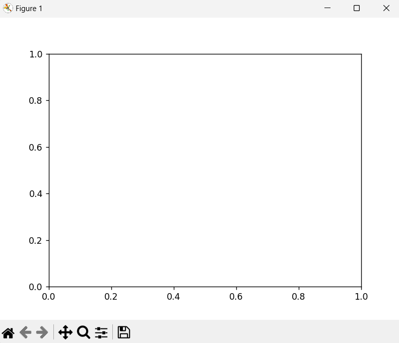
plt.subplots()creates a new figure and a single subplot (Axes) inside it.figis the Figure object, andaxis the Axes object where you can plot data.
Sometimes you may be struggling since you don’t know what Axes is. Don’t worry. I will explain it.
In matplotlib, The term Axes refers to the entire plotting area or the subplot within a figure. An Axes object is a container that includes everything that you need for a plot, including:
- The plot itself - Lines, bars, scatter points, etc.
- X-axis and Y-axis - These are the horizontal and vertical lines that define the coordinate system for the plot.
- Ticks - The markers along the axes that denote specific values.
- Labels - Names of the axes (e.g., “Time”, “Price”).
- Title - The title of the plot.
- Gridlines - Lines that cross the plot, making it easier to see values.
In short, Axes is the region of the image with the data space, including all the elements that help in representing the data.
Hey Chanaka I’ve got the idea of Axes. So what about the Axis?
Okay, Lemme explains it.
The term Axis refers to the individual axis of the Axes object. There are usually two Axis objects in a standard 2D plot. The x-axis and the y-axis. Each Axis object is responsible for:
- Drawing the axis line - The line that represents the axis.
- Setting the ticks -The locations along the axis where labels are placed.
- Setting the tick labels The labels for each tick.
- Configuring the scale
An Axis object is a part of the Axes object and handles the specifics of the individual coordinate axis.
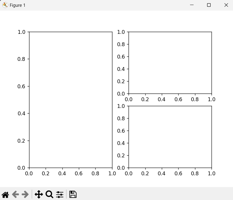
3. Creating a Figure with a 2x2 Grid of Axes
import matplotlib.pyplot as plt

fig, axs = plt.subplots(2, 2)  # a figure with a 2x2 grid of Axes

plt.show()
Run the code, and you will see this
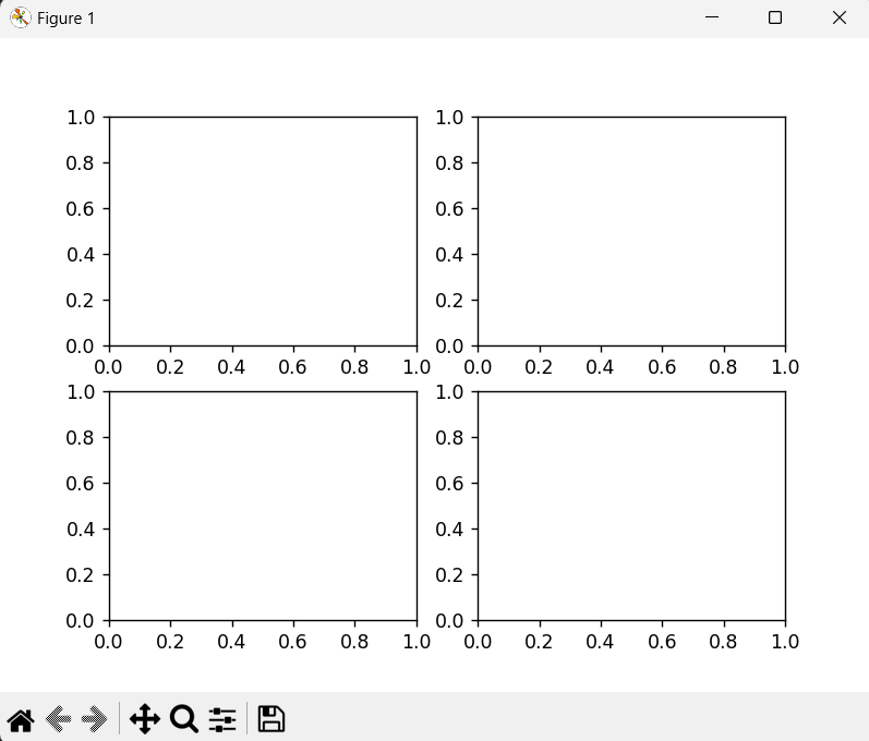
- This code creates a figure with a grid of 4 subplots arranged in 2 rows and 2 columns.
4. Creating a Figure with a Custom Layout Using subplot_mosaic
import matplotlib.pyplot as plt

fig, axs = plt.subplot_mosaic([['left', 'right_top'],
                               ['left', 'right_bottom']])

plt.show()
Run the code and you will see this
plt.subplot_mosaicallows you to create a custom layout for your subplots.- In this example, the layout consists of one subplot named 'left' that spans the left column, and two subplots named 'right_top' and 'right_bottom' in the right column.
- In inner two arrays, you can see the same name
left. That is telling us “Hey I will draw a subplot named left in the first column”. And the other two names are different. It is telling us “Hey I will draw two subplots in the second column named right_top and right_bottom”.
Still confused? Let’s draw this.
import matplotlib.pyplot as plt

fig, axs = plt.subplot_mosaic([['left_top', 'right_top'],
                               ['left_bottom', 'right_bottom']])

plt.show()
Run the code and you will see this

I think now you can understand what is happening. In this code, we changed the “left” to “left_top” and “left_bottom”. Then it says “Hey I will draw two subplots called “left_bottom” and “left_bottom” in the first column and two subplots called “right_top” and “right_bottom” in the second column.
Artist
In Matplotlib, the term Artist is a fundamental concept that refers to any object that can be rendered on a figure.
This includes:
- Figures - The entire canvas or area where plots are drawn.
- Axes - The specific areas within a figure where the actual data plots are made.
- Axis - The x-axis and y-axis that define the coordinate system for the data.
- Plot Elements
Characteristics:
- Each
Artistknows how to draw itself on the canvas. Artistscan be as simple as a line or a piece of text, or as complex as an entire subplot (Axes).- Most
Artistsare associated with anAxesobject and cannot be shared between differentAxesor moved from oneAxesto another. Artistsare hierarchical. For example, anAxesis anArtistthat contains otherArtistslike lines, text, and patches.
Input Types for Plotting Functions
- Expected Input Types
- Numpy Arrays -
numpy.arrayornumpy.ma.masked_array. - Array-like Objects - Objects that can be converted to numpy arrays using
numpy.asarray, such as lists, tuples, or other sequences. - Not Recommended - Direct use of
numpy.matrixor other array-like objects (like pandas data structures) may not work as intended. It is a common practice to convert these tonumpy.arraybefore plotting. - To convert a
numpy.matrixto anumpy.array
import numpy as np
a = np.matrix([[2, 4], [6, 8]])
a_asarray = np.asarray(a)
2. String-indexable Objects
- Plotting functions can also parse objects that can be indexed by strings, such as dictionaries, structured numpy arrays, or pandas DataFrames.
- You can pass such objects using the
datakeyword argument and refer to the variables by their string names.
np.random.seed(19680801) # seed the random number generator.
data = {'a': np.arange(50),
'c': np.random.randint(0, 50, 50),
'd': np.random.randn(50)}
data['b'] = data['a'] + 10 * np.random.randn(50)
data['d'] = np.abs(data['d']) * 100
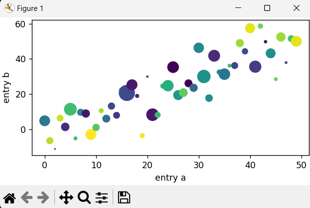
fig, ax = plt.subplots(figsize=(5, 2.7), layout='constrained')
ax.scatter('a', 'b', c='c', s='d', data=data)
ax.set_xlabel('entry a')
ax.set_ylabel('entry b')Code example from the documentation.
Let’s try to understand.
np.random.seed(19680801) — Ensures reproducibility of random numbers. That means each and every time when you run the code, It will generate the same set of numbers.
data = {'a': np.arange(50),
        'c': np.random.randint(0, 50, 50),
        'd': np.random.randn(50)}
data['b'] = data['a'] + 10 * np.random.randn(50)
data['d'] = np.abs(data['d']) * 100datais a dictionary containing numpy arrays.ais an array of integers from 0 to 49.cis an array of 50 random integers between 0 and 49.dis an array of 50 random numbers drawn from a standard normal distribution.bis derived fromawith some added noise.dis modified to be the absolute value of itself, multiplied by 100.
fig, ax = plt.subplots(figsize=(5, 2.7), layout='constrained')- Create a figure and an axes object.
figsizesets the size of the figure.layout='constrained'ensures that the layout is automatically adjusted.
ax.scatter('a', 'b', c='c', s='d', data=data)ax.scattercreates a scatter plot.- The x-axis uses values from
data['a'](specified by'a'). - The y-axis uses values from
data['b'](specified by'b'). - The color of the points (
c) uses values fromdata['c']. - The size of the points (
s) uses values fromdata['d']. data=datatells Matplotlib to look for the values of'a','b','c', and'd'in thedatadictionary.
ax.set_xlabel('entry a')
ax.set_ylabel('entry b')- Sets the x-axis label to “entry a”.
- Sets the y-axis label to “entry b”.
Okay, I hope you got the idea. Then I will make the second part of this article and stay in touch with me.
In summary, Matplotlib is a popular plotting library in Python, everything you see on a plot is called an “Artist.” This includes the entire figure, the axes (plots), and all plot elements like lines and text. The figure is the main container that holds everything, while artists are the individual pieces that make up the plot. Understanding the difference between figures and artists helps you create and customize visualizations effectively.
If you found this useful, follow me for future articles. It motivates me to write more for you.
Follow me on Medium
Follow me on LinkedIn